
I just want to say I am in no way suggesting that this is the only way to edit your photos, I'm still working it out myself and my images are far from perfect. However, I often see pictures on Etsy and other sites that would look a million times better if they were just tweaked a little bit.
I use Photoshop for my images, but there is free software available such as GIMP and I think you can get old versions of Photoshop for free now.
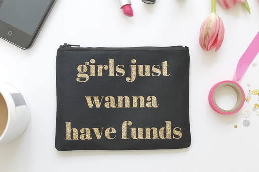
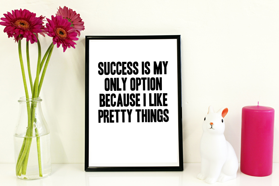
This is my original image; it looks ok, but there is definitely room for improvement.
I use Photoshop for my images, but there is free software available such as GIMP and I think you can get old versions of Photoshop for free now.
This is my original image; it looks ok, but there is definitely room for improvement.
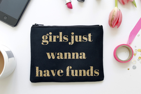
The first thing I do is Auto Tone (Image > Auto Tone). This just makes the white slightly whiter, the black blacker and sharpens everything up a little bit. I find Auto Tone, Auto Colour and Auto Contrast interchangeable, and I always test which one improves the pictures best. However, which ever you choose, stick with it for all your pictures so they all have the same look.
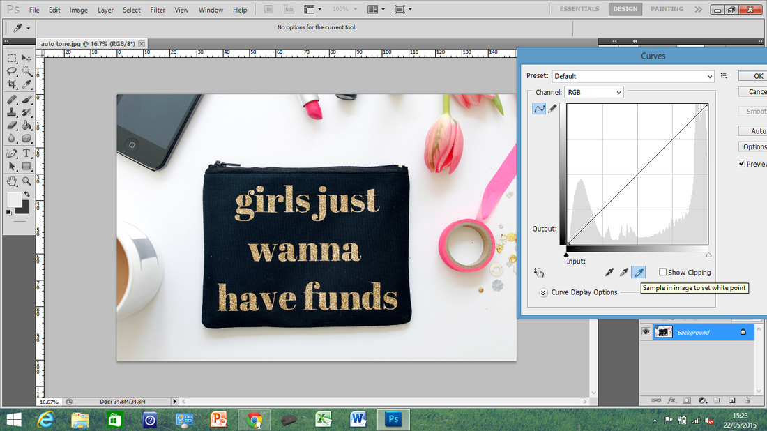
The next thing I do was a tip given to me by Louby from All Her Glory, and has been working a treat on these images with a white background. You go to Image > Adjustments > Curves and click on the third little pipette in the pop up window which has a white tip. Then you want to click on a white area of your picture. Try to click on a bit that's already pretty white, if you click a shadow you'll probably wash the image out completely. If it still isn't white enough, click a spot that's marginally darker and keep going until you are happy with the colour.
If you don't have a white background, then the best thing to do here is to go into Image > Adjustments > Brightness/Contrast. Up the brightness by about 60, and lower it until you find the point it looks best at; I find if you start at the bottom and go up, you tend to stop before it's really at optimum brightness! Do this again for contrast, this will bring some of the depth back which was taken out by brightening the whole image. It probably won't need to be much higher than 20, but play about with it until you are happy.
If you don't have a white background, then the best thing to do here is to go into Image > Adjustments > Brightness/Contrast. Up the brightness by about 60, and lower it until you find the point it looks best at; I find if you start at the bottom and go up, you tend to stop before it's really at optimum brightness! Do this again for contrast, this will bring some of the depth back which was taken out by brightening the whole image. It probably won't need to be much higher than 20, but play about with it until you are happy.
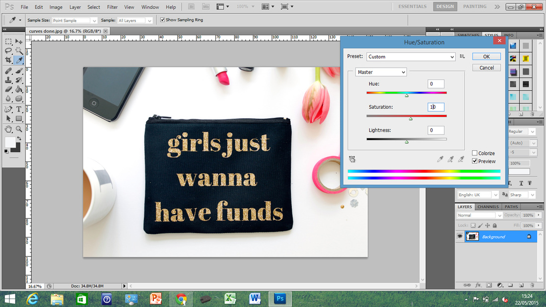
Next up is Saturation (Images > Adjustments > Hue/Saturation.). This will bring out the colours in the image. Mine is already pretty bright, so I've just boosted it up by 10 to get the pinks to really stand out.
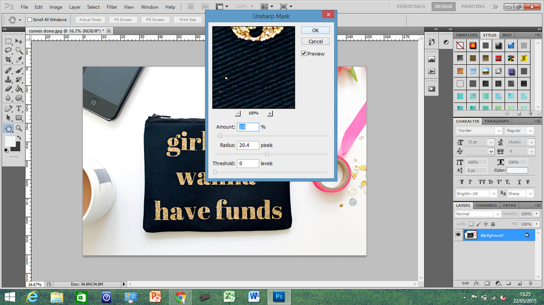
The last thing I always do is sharpen the image, and to do this I use the Unsharp Mask (which makes no sense to me). Go to Filter > Sharpen > Unsharp Mask then I usually put it up to 10%, you don't want to oversharpen, just make the image look a bit more crisp and polished.
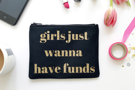
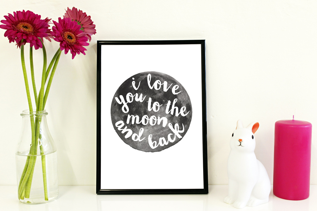
And that's it! Pretty simple, but I think it really makes a difference. The product looks like it has much more depth, and the colours stand out so much more than they did. Once you get into a routine and know where you are clicking and what you are aiming for, it takes no time at all; I can do an image in under a minute now.

I hope that was useful!
Laura x
Laura x


 RSS Feed